ORBIT KENDAMA’S
Can you reclaim a lost pastime and make it relevant today?
University life often revolves around parties, heavy drinking, and the stress of academic demands. Many students find themselves caught
in a cycle of burnout, struggling to balance fun with their studies and mental well-being.
Seeing this, we recognized an opportunity to redefine student life
for Gen Z—those aged 18-25. Our goal was to create a brand that encourages a lifestyle of balance, blending social enjoyment with mindfulness and focus. The challenge: how to engage a generation
that values both fun and self-care, guiding them towards a healthier, more balanced way of living.
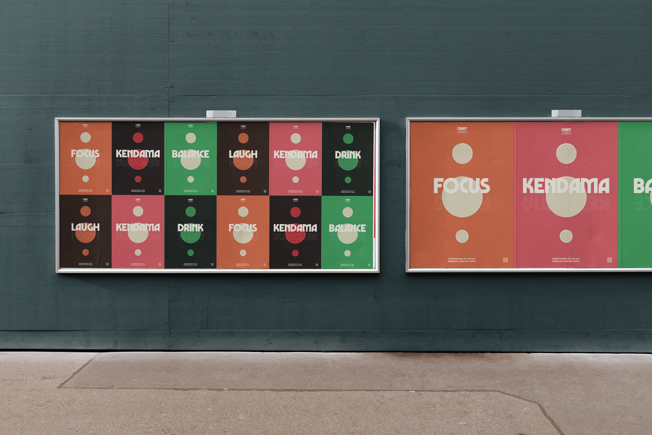
SCOPE
Web Design
Brand Identity
Packaging design
Social media design
Advertising campaign
Web Design
Brand Identity
Packaging design
Social media design
Advertising campaign
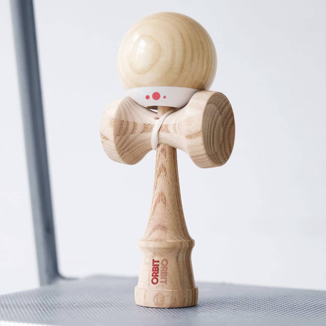
THE PRODUCT
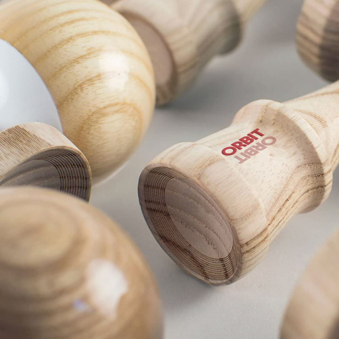
The Kendama is an ancient Japanese toy, it is a development of the French game ‘Bilboquet’ imported through the Silk Road reaching the Nagasaki Port in the 18th Century. It was initially a drinking game called ‘Sun and Moon ball’ but today it is a game of persistence, focus and mindfulness.
Practising Kendama in Japan is viewed as a martial art or ‘Do’. Mastering the art of training body and mind is seen as improving your character. It requires ‘Shinen and Kokoro’ (concentration and persistence) making it a respected characteristic by employers.
Practising Kendama in Japan is viewed as a martial art or ‘Do’. Mastering the art of training body and mind is seen as improving your character. It requires ‘Shinen and Kokoro’ (concentration and persistence) making it a respected characteristic by employers.

CONCEPT
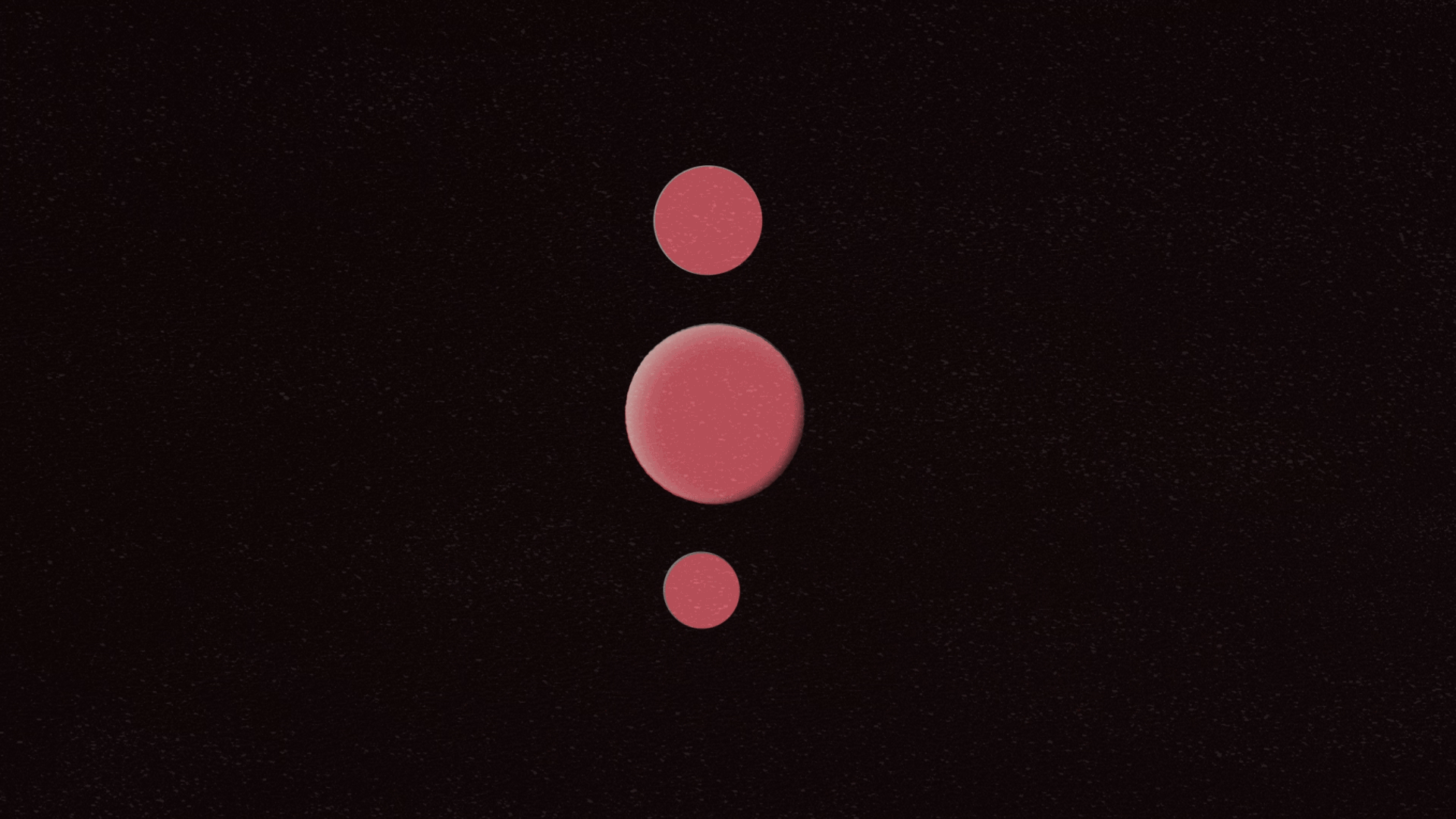
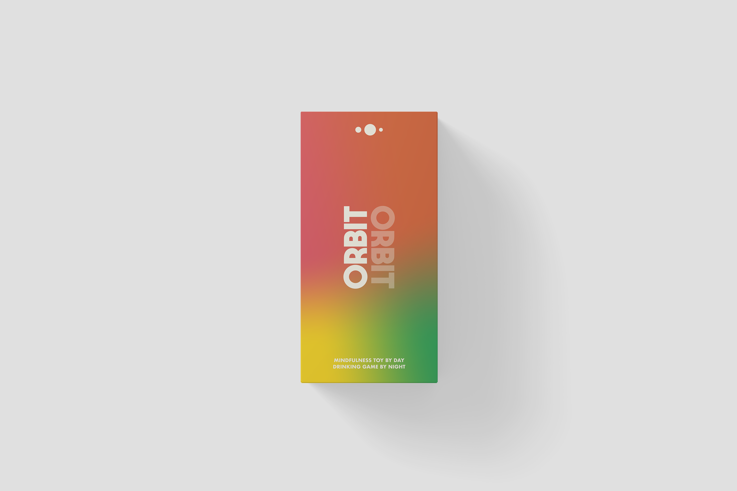
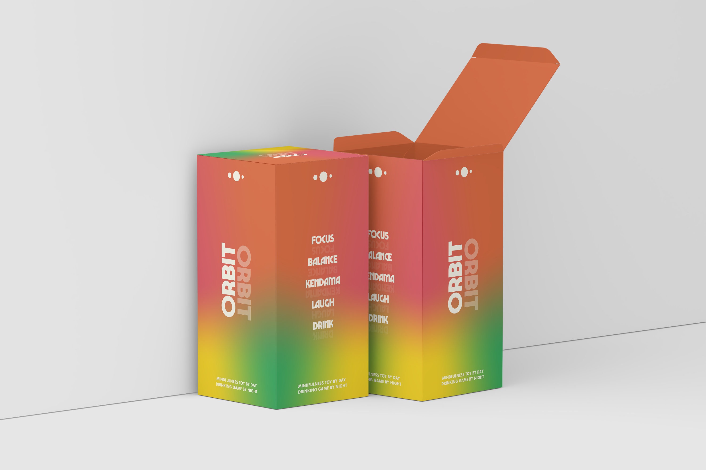
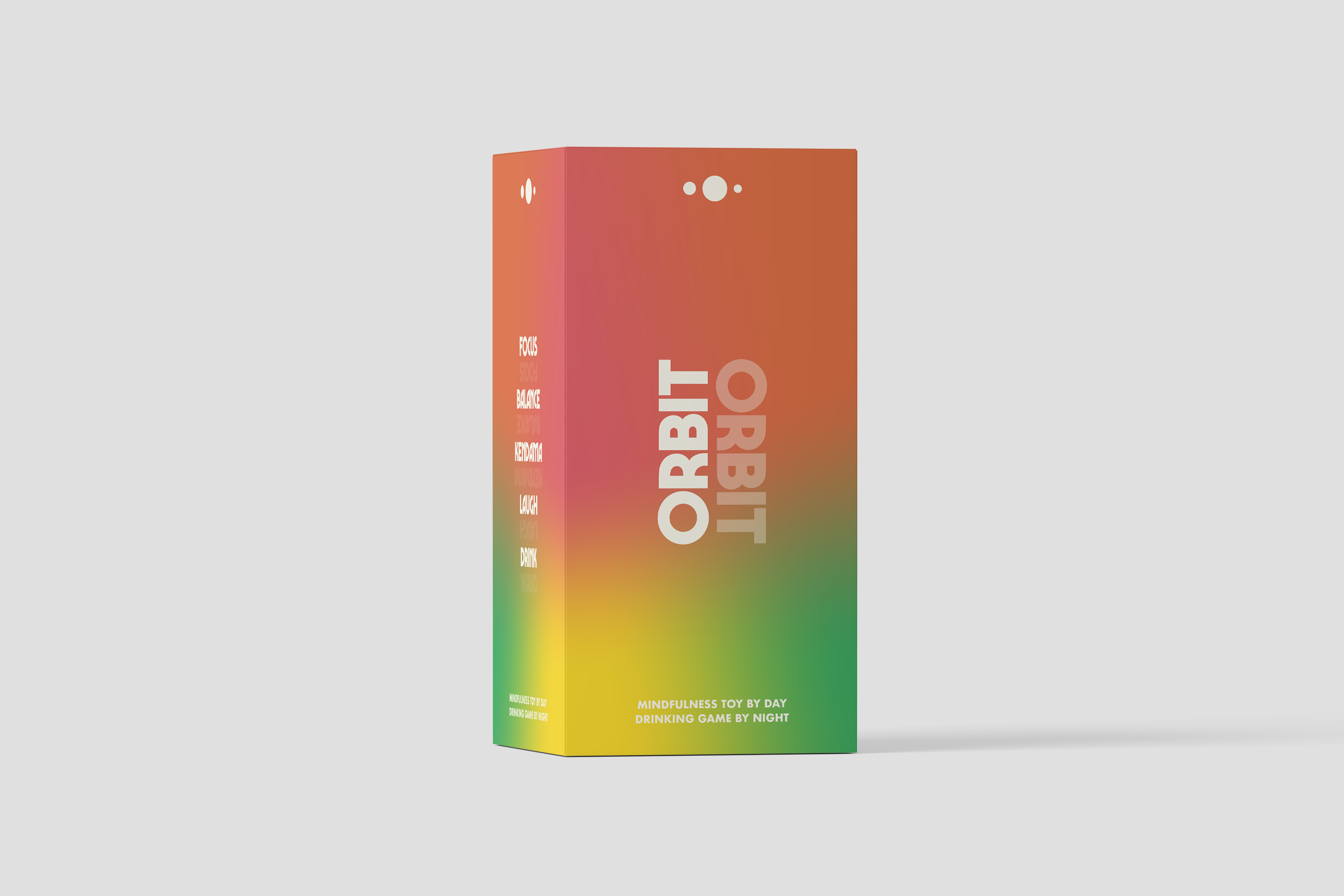
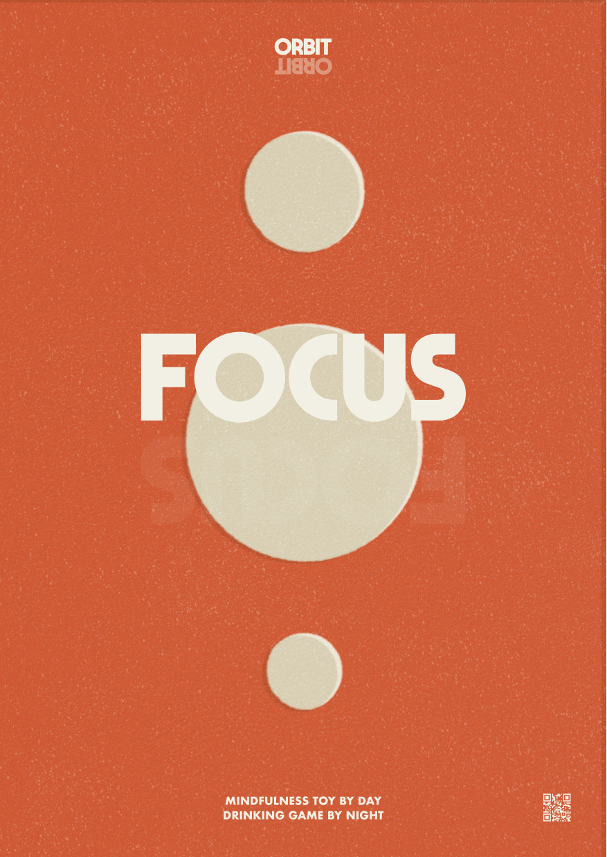
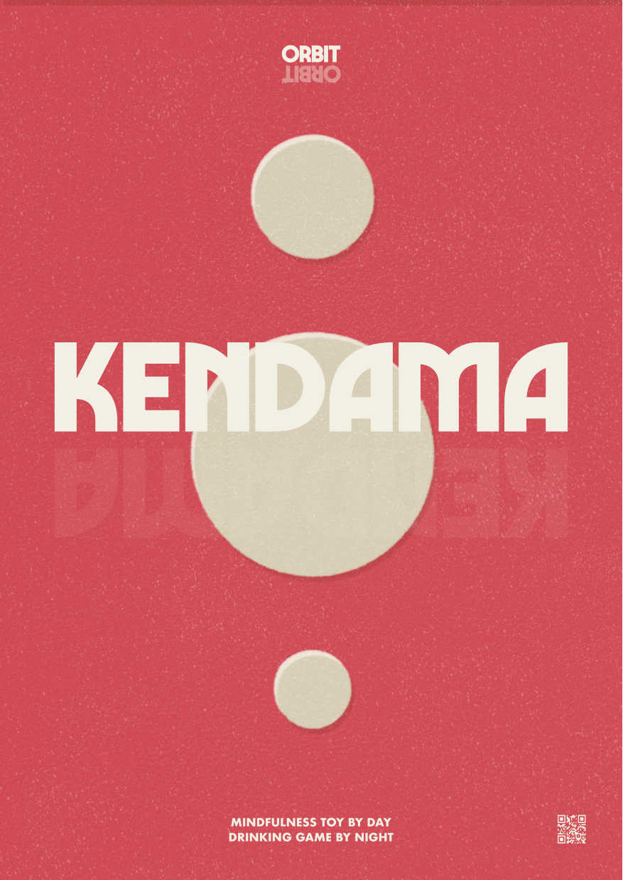
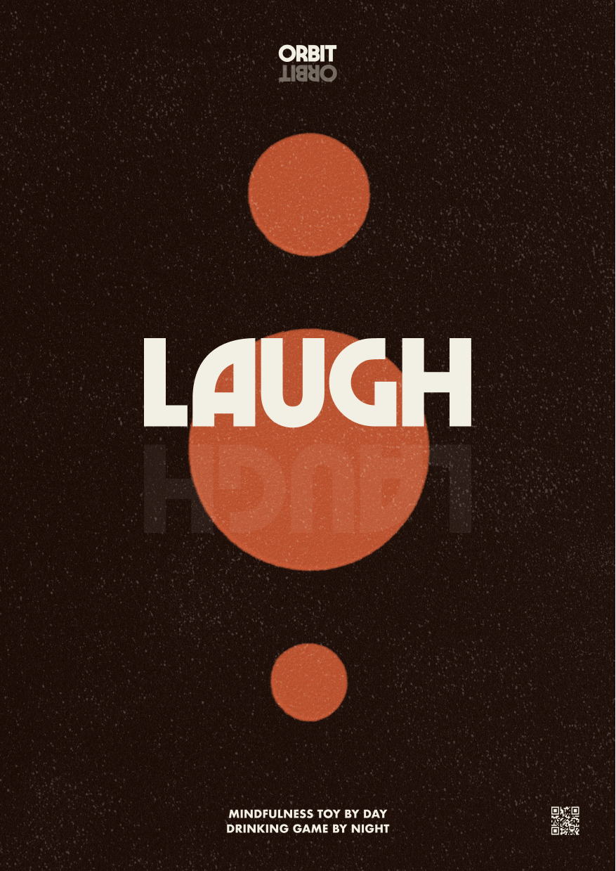
To reflect the history of the product, this brand has two sides, light and dark. A mindfulness brand by day and a sociable drinking brand by night. The core values are balance, play and focus.
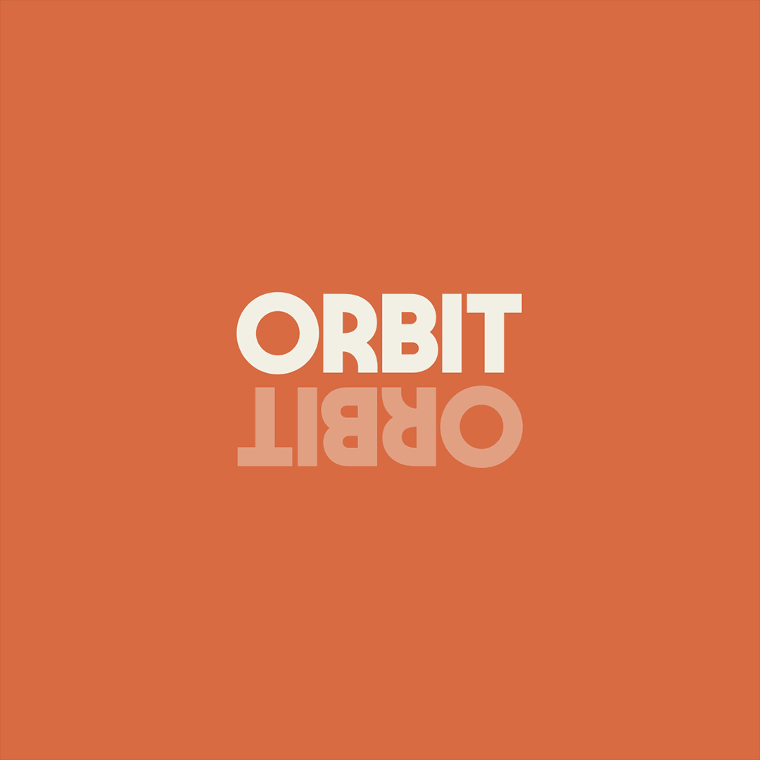
The name ‘Orbit’ is inspired by its original name ‘sun and moon ball’. The light and dark colour palettes are used to emphasise the contrasting sides of the brand.


LOGO DESIGN.
To emphasise the two sides of the brand, the logo is a clear, balanced, visual representation of the daytime sun with the nighttime moon reflected underneath it. Using the typeface Marvin visions as a nod to the celestial-themed
brand identity.
brand identity.